
If you take a look at the database documentation you will notice there has been a change. The new “Redwood” look and feel has been applied. I thought I would give my opinion, for what it is worth.
Remember, these are my first impressions.
Change is always bad!
As soon as you change something, people (like me) are going to come out of the woodwork and start criticising it. Within a week everyone will have forgotten what things used to be like, and a new steady state will be achieved.
Everything except My Oracle Support (MOS). I’ve never got used to the “new” interface, which we have probably had for a decade, and I still think it is bad… 😉
Expand (Not) All
The Expand/Collapse button only expands a single level down the hierarchy. That makes finding things in some manuals impossible. I regularly do an expand-all, then search using the browser search (CTRL+F) to find a feature or parameter. This change of behaviour is a complete disaster!
There is no way this was tested by anyone who actually uses the docs for their job. Either that, or their feedback was ignored.
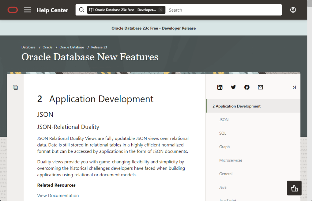
Layout
The basic page is split into three columns, with a margin on each side (see here).
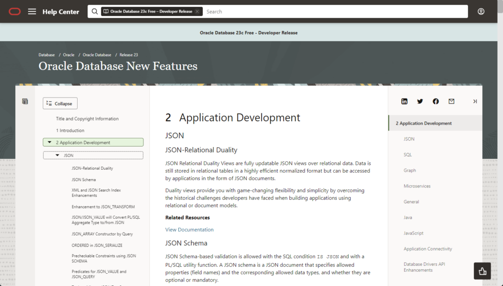
On the left is the index, which is similar to what we had before. The middle panel is the main bit of the text. The panel on the right is another sort-of mini index. I really don’t understand what the right panel is for. If the share links were put on the left index, the right panel could be removed entirely. The two side panels are collapsible, which is good. I get the feeling my first visit will always have an additional click to collapse the right panel.
Responsive?
The layout is responsive, so as you alter the width of the page some of the panels will collapse. Unfortunately the pointless right-hand panel seems to have priority over the useful left-hand panel. You quite often get this sort of look. Also, when you expand the screen again, the useful left-hand panel doesn’t reappear.
This happens to be the default when the docs are viewed on my work laptop. Yuck! You can manually correct it by collapsing the right panel and expanding the left. That’s two extra clicks. Yes. I am really so lazy that this bothers me.
The margins also expand as the page expands. At their biggest they are about 5cm (1.5 inches) on each side. That seems rather wide to me. I’ve read that most people find reading a narrower panel of text easier, but when I read the docs I like to have them wide. As a result the excessive margins annoy me. I’m sure the vast majority of people will not be bothered by them though. Once again, I am the victim of my large monitor. On a normal size screen the margins don’t seem excessive at all.
Text Size
The default text size for the central column is good for me. They’ve resisted the urge to make everything big and bubbly. Technical docs are not the same as normal websites, and I prefer some moderation in text size. If people need bigger text, the browser can zoom.
The left index is possibly a little smaller than I would like on my main monitor, but when I look at it on a “normal person” monitor, or on my work laptop, it looks great. In this case I’m the victim of my excessively sized monitor. 🙂
Accessibility
I’m no expert on accessibility, but suffice to say the docs fail. So does my website, so I’m not in a position to criticise that much, but it does seem odd that a big redesign like this was not done with accessibility in mind.
I imagine the colour contrast on the left and right panels are not great. They are fine for me, but I see these colour contrast issues all the time, including on my own website.
Community Feedback?
In the future, please reach out the the community to get feedback on important issues like this. You have a pool of Oracle ACEs who are under NDA, who are more than willing to help with feedback! The two glaring mistakes would have been picked up really quickly if you had asked for feedback from people who actually use the docs constantly.
Conclusion
The expand-all capability has to be returned to the index ASAP! Some docs, specifically the reference manuals, are unusable without it. This is a massive fail!
The right-hand panel has to go, or be collapsed by default! Its only value is to waste space. Please get rid of it!
As for everything else, it’s all different but the same. Nothing to see here. 🙂
Cheers
Tim…
Agree fully on your conclusion! Not expanding the sections is a show stopper for me particularly when quickly looking for a init.ora parameter, now I have to figure out other ways. The right column which will remain unused by 99% users, reminds me of the acrobat pdf reader where I have to collapse every time I open a pdf doc.
Tim,
Thank you! I could not agree more about all this!
To summarize:
– Pointless right panel,
– Pointless dynamic left & right margins, eating horizontal space exactly when we need it most
– Left index with annoyingly small typefaces, and too much wasted vertical space, making it feel unbalanced, and harder to read than before.
The former page layout was just excellent, was there any compelling reason for changing it, for an inferior result?
Whoever did this, and/or supervised it, should bear this in mind: the Oracle Database documentation set is one most valuable asset of Oracle Corp, the result of decades of careful writing work and maintenance (and not many competitors have come close to that, and retained such a high level of quality over such a long time span). And, in the best interest not only of Oracle Corp, but of the entire Oracle Database ecosystem, it should continue to be managed with utmost care.
(At least it seems there was no noticeable change to the main text body—as far as I can tell at first glance—and fortunately hyperlinks still work.)
Best regards,
Considering the recent changes to the Oracle documentation’s ‘Redwood’ look and feel, what are the potential implications of the Expand/Collapse button now only expanding a single level down the hierarchy? How might this impact users who rely on searching through the documentation using browser search (CTRL+F) to find specific features or parameters?
luqmaan s:
Here’s an example. Let’s say I’m already in the Database Reference manual looking at something.
https://docs.oracle.com/en/database/oracle/oracle-database/23/refrn/index.html
I now want to find something about the v$session view. I click the “Expand” button, then use CTRL+F and search for “v$session”. In the old look & feel I would find what I need. In this version of the docs I would not. Instead I have to do one of three things.
– Search for it using the search bar. Oracle search is not the best…
– Manually type in the “…/toc.htm” URLs and search on that.
– Manually expand all the entries in the index until I find this.
The new look & feel has removed a commonly used method of navigating the documentation, which was to Expand-All and GTRL+F to fine the thing you are looking for.
When you introduce something that negatively impacts the users, that’s not great.
Cheers
Tim…