 I’ve continued to play around with Cloud Control 13c and I’m generally getting a nice vibe from it.
One of the things I really hated about Grid Control 10g and 11g was the navigation. It felt like you had to click on 50 links to get to the thing you wanted. When Cloud Control 12c came along and had a main menu it was a massive improvement. Even so, it was still a little annoying as the menu was split, with some bits on the left and some bits on the top-right.

In Cloud Control 13c, these menus have been brought together into the top-right of the screen.
![]()
If the screen size is smaller, the buttons collapse to show just the icons, which saves space.
![]()
It probably sounds really trivial, but having both menus together is a really nice touch. I can’t count the number of times I’ve been fumbling around, unable to find something, only to remember it is in that blasted menu at the top-right. Now there is no excuse. 🙂
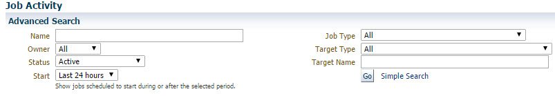
The job scheduler navigation is also a lot nicer. In Cloud Control 12c we had a bunch of drop-downs and a “Go” button.
In Cloud Control 13c there are tiles along the top to alter the context of the output and the tree on the left allows you to quickly flip between criteria.
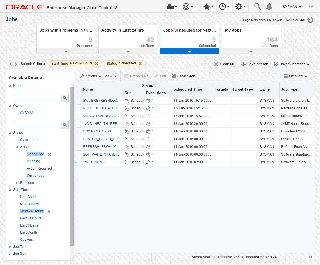
It is so much quicker to get the information you want this way.
So as far as I’m concerned, Cloud Control 13c is getting a big thumbs-up from a navigation perspective!
A couple of people have asked my impression about the new look and feel. If we ignore the navigation, most of the pages are quite similar to what we had before, so there is no need to panic. Overall it has a sparser, cleaner look, which is more in keeping with the way the web is these days, so I think that’s a good thing. Anyone who has used Oracle Cloud will find the look very familiar. 🙂
I guess the biggest bonus of the new look and feel is it is more responsive. On some of the old pages you had a lot of sideways scrolling to do if you have a small browser window. The new look and feel deals a lot better with that. It’s not perfect, but it is better. So I’m giving the new look and feel a big thumbs-up too!
Being the bitter old man that I am, I reserve the right to change my mind and hate it all in the future. 🙂
Cheers
Tim…
Caveat: I use a very small subset of the functionality available from Cloud Control, so my opinion is going to be based on the bits I use a lot. It might be that other areas have been adversely affected by the new navigation or look and feel, but the bits I care about are looking good.
For what it’s worth – your comments echo my feeling. There is a lot to like in this release of EM. While there are still an annoyingly large number of things that have moved around – as with every release of EM Grid Control and Cloud Control so far – it’s been much easier to get used to the changes and get comfortable with ‘getting things done’.